The problem was never the design. It was that the product couldn't show its work.
The team knew it and had been working the problem for months. A new product, sophisticated underneath, and the people it was built for could not reach what it understood. They brought Bayesian Leaf in against a deadline, to set design direction for a new version, with onboarding one thread inside it. The mandate kept expanding, from that first phase to standing product and design direction.
Who this was for
The people using it have to say something true about a place, under time pressure, to someone who will act on it. A briefing at eight in the morning. A hotspot that moved overnight. A question from a director who wants an answer, not a caveat.
They are not all the same person. Some need complete coverage and will check every source before they say anything. Some need one defensible answer by Monday and will not learn a query language to get it. Some are not at their desk at all, and need to know whether anything happened while they were gone.
The same screen serves all three, and what one of them needs can make the screen worse for another. That tension sits underneath everything else here.
01·the diagnosis
The work: make the product legible enough to work self-serve as the platform opened to new kinds of people. Every new account required hands from the team. Fine at ten accounts, impossible at a hundred.
The opaque system
Answers came out. How the system got there stayed hidden.
Someone new landed in a workspace with four competing workflow entry points on the welcome screen, data-source toggles and internal debug views still in the interface, a tab bar that buried the answer, and a search that was really a chat box with no visible scope.
None of that is carelessness. It is what an early product looks like. A small team builds quickly, everyone close to the domain, and the interface ends up legible to the people who built it and to nobody else.
You could get an answer. You couldn't see how the system reached it, and steering it took knowing where to look. The decisions were invisible.
✿The real problem was the gap between what people need and what they know how to ask.
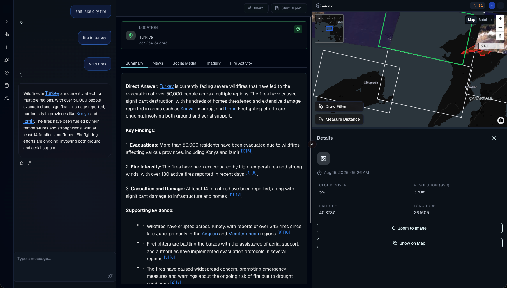
The read
The instinct is to treat this as a design cleanup. It wasn't. Every problem traced back to the same thing: the product made decisions the person couldn't see. The work was to make those decisions legible.
✿A long list of separate problems reduced to two questions: does a new person ever find value, and when they do, does the workflow close.
02·made legible
Made legible
Pull the system's decisions to the surface.
Scope shown once, in dedicated widgets for location, time, and topic, instead of repeated everywhere. The reasoning moved into the workbench as one line that expands into the full step list. The answer became the default landing state. A guided onboarding layer taught the product's own anatomy: how it reasons, how to refine scope, where the evidence lives, how the spatial view works. A monitoring model let a person watch a search over time instead of re-running it by hand.
Confidence scores meant nothing to the people arriving. Percentages became semantic tiers traced to corroborating sources: the product is decision support, not the decision.
Product sponsored the direction and carried it to the founders inside five weeks.
✿Making the system's judgment visible, not decorative.
✿The monitoring concept came out of a working session with the product manager, weeks before anyone asked for it. Direction that ships months later is still direction.
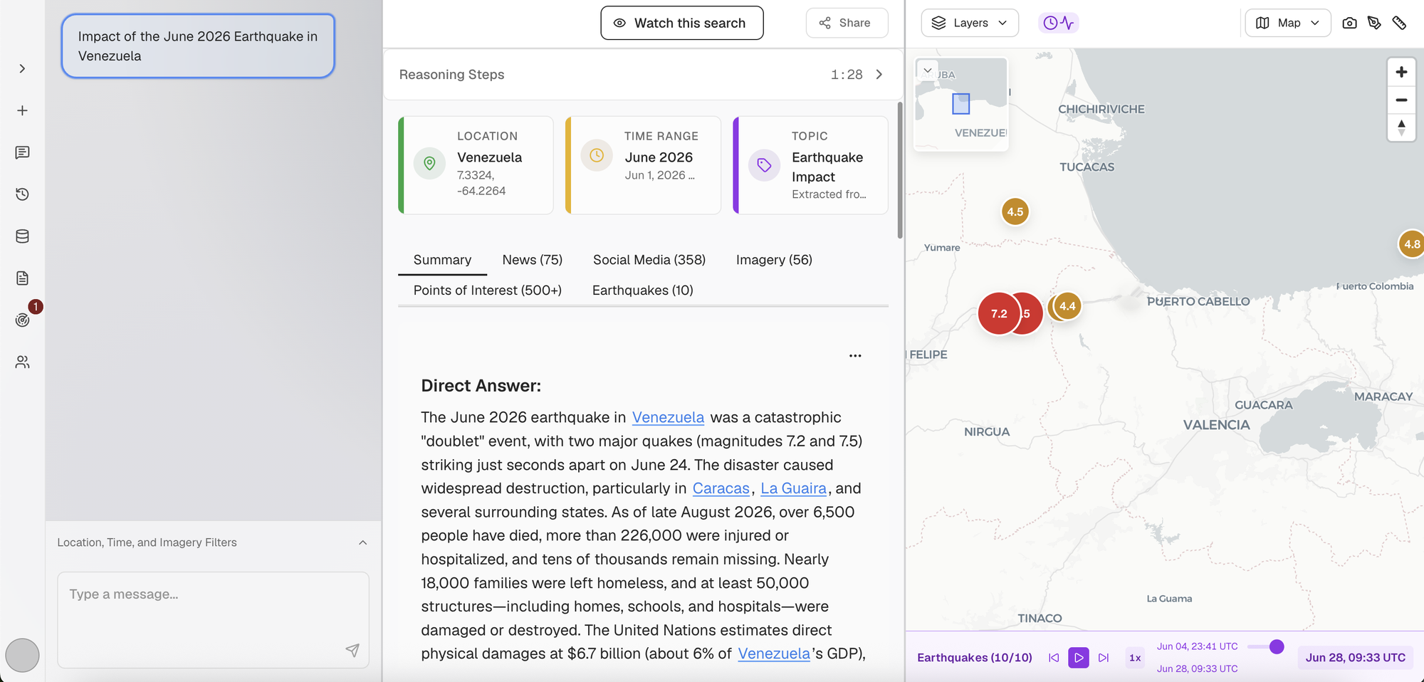
03·shipped and adopted
Shipped and adopted
The direction didn't sit in a deck.
The prototype went to engineering as the spec. The welcome-screen cleanup shipped, and the guided onboarding cleared to engineering.
04·the inversion
The founder was using the product on live work and kept surfacing friction. Underneath a long list of separate problems was one problem, not many.
One reframe turned a list of separate problems into a single direction the team could act on. That is decision infrastructure made visible.
The direction shipped and became how the product works.
A workshop with product on interrupts surfaced a scenario nobody had a name for: what the product should do when the thing you are searching for has no date yet. Product recognized it as the shape of something the founders had been circling for months, named it monitoring, and it went on the roadmap.
A scoped design engagement became standing product and design direction.
The founder kept bringing what he found into the product conversation, and Bayesian Leaf was pulled into the recurring product sync alongside product.
Week two produced a set of principles. The team adopted them as the bar for what gets built: if a change served none of them, it was not a priority. Direction stopped being a meeting and became a standard.
✿I ruled out a redesign. Same screens, the decisions made visible.
✿I wrote these so the team could tell me no with a reason.
Instrumentation came after the product. The engagement left a measurement spec behind.
What this unlocked
Scope is visible and correctable rather than inferred silently. The reasoning is one step away rather than hidden. The answer is where the product opens.
A set of principles the team adopted as the bar for what gets built. If a change served none of them, it was not a priority. The team could say no with a reason.
Definition arrives before the build rather than inside a finished artifact. Each piece of work now starts with a short brief that sets scope before anything gets designed.
Bayesian Leaf made an invisible system legible. The screens barely changed.
The one question
Can the people using your product see the decisions it's making for them?
If the answer is no, that's rarely a design problem.
Design shows the work. Decision infrastructure is the work.
Let's talk
If your product makes decisions the person in front of it can't see, start there.
Thirty minutes. Bring what's stuck. No deck, no pitch. If it isn't work I do, I say so.
Bayesian Leaf is the practice of Hew Suber.